


Furlenco 2.0
Mobile App & UX UI Design
UX Leadership, Research, Strategy, Hands-on Design, Prototyping and Testing

Prev Project
Next Project

ABOUT THE PROJECT
Furlenco was looking for an evolution to broaden its userbase and offerings to now give customers the power of choice between renting, subscribing, & “buying” furniture as a new feature.

Implement a Flexibility of Choice to switch between Buying/Renting/Subscribing during the discovery funnel.

Build and apply a new UX/UI Design System to align to the new brand look and positioning
Enhance the existing Self-serve Subscription Management UX with a faster automated flow
Leverage a better UX with Layouting service, that can generate Customized user-views and target better.
Design Framework
EMPATHIZE :
The Foundation of Understanding the User


DEFINE :
Identifying Requirements and Opportunities
IDEATE:
Building a Scalable Blueprint and Experience
PROTOTYPE & TEST :
Validating with Users and Stakeholders
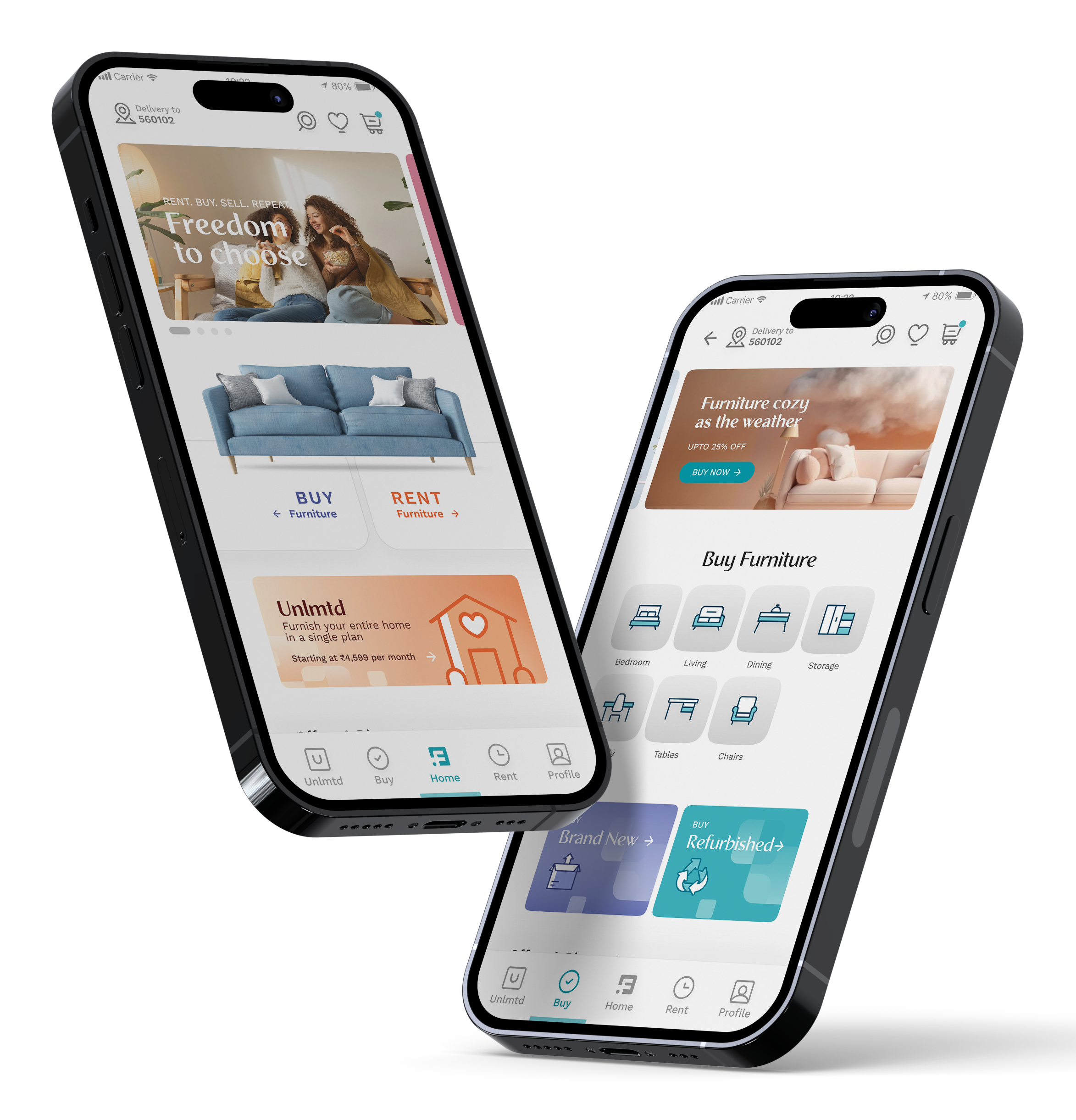
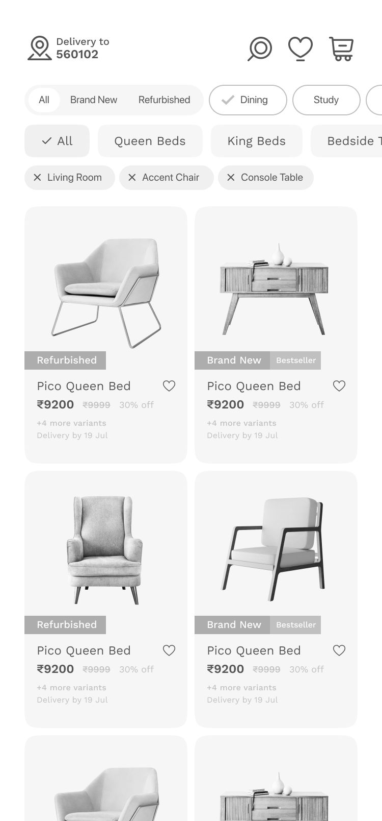
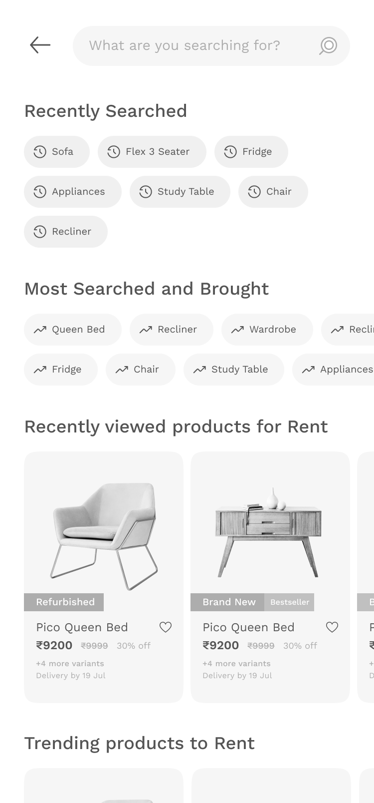
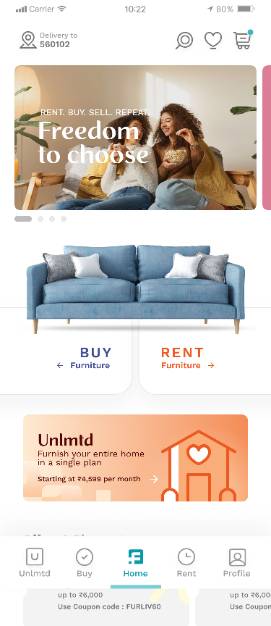
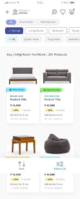
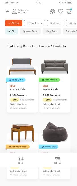
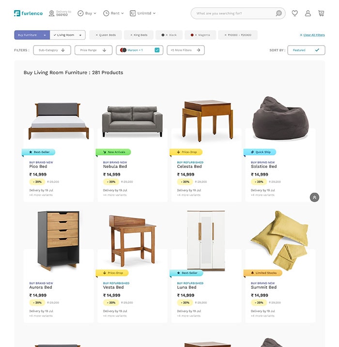
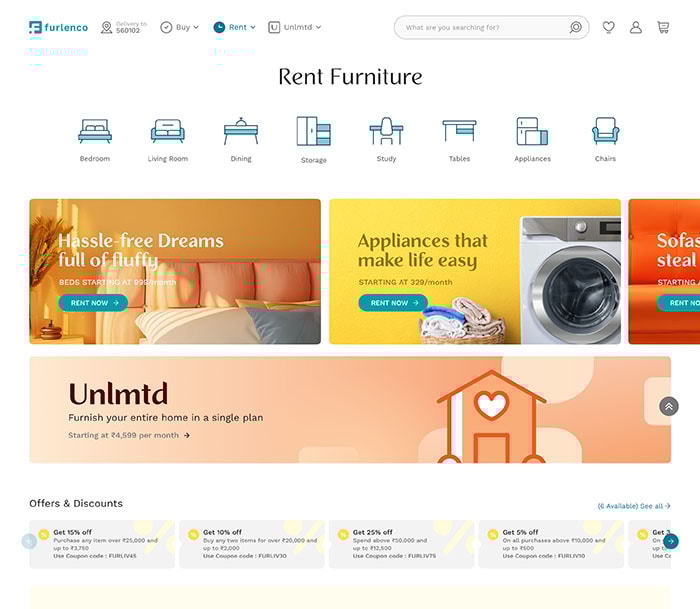
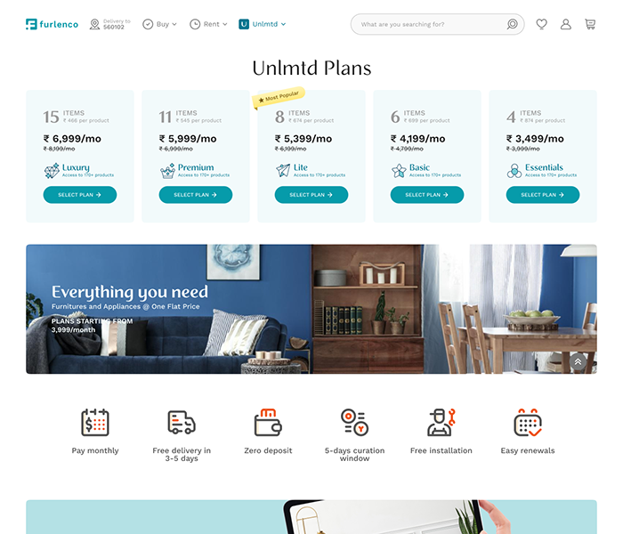
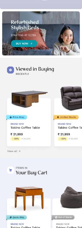
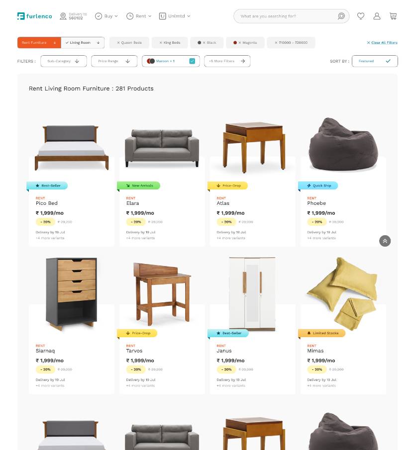
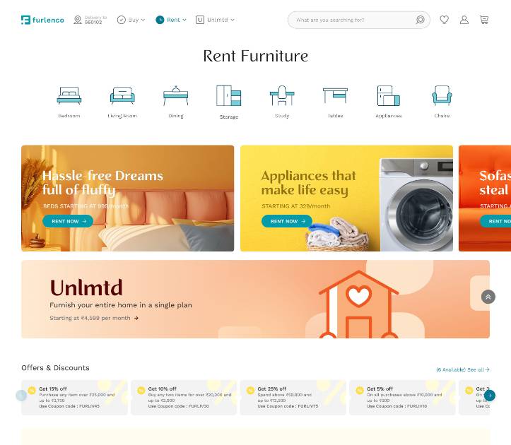
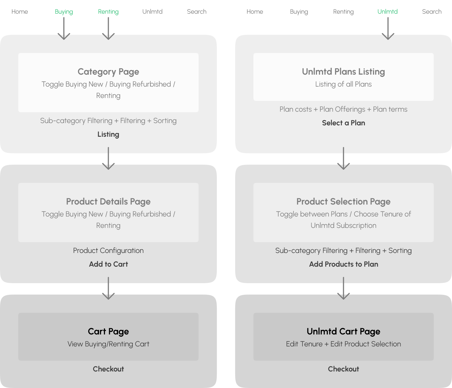
Information Architecture with Enhanced Product Discovery & Customization
We designed Furlenco's information architecture to make it easy for users to switch between buying and renting directly from the product pages. By adding a furniture customization feature, we created a more personalized experience that guides users smoothly from browsing to selecting their final choice.
Buying / Renting Information Architecture

Unlmtd Information Architecture
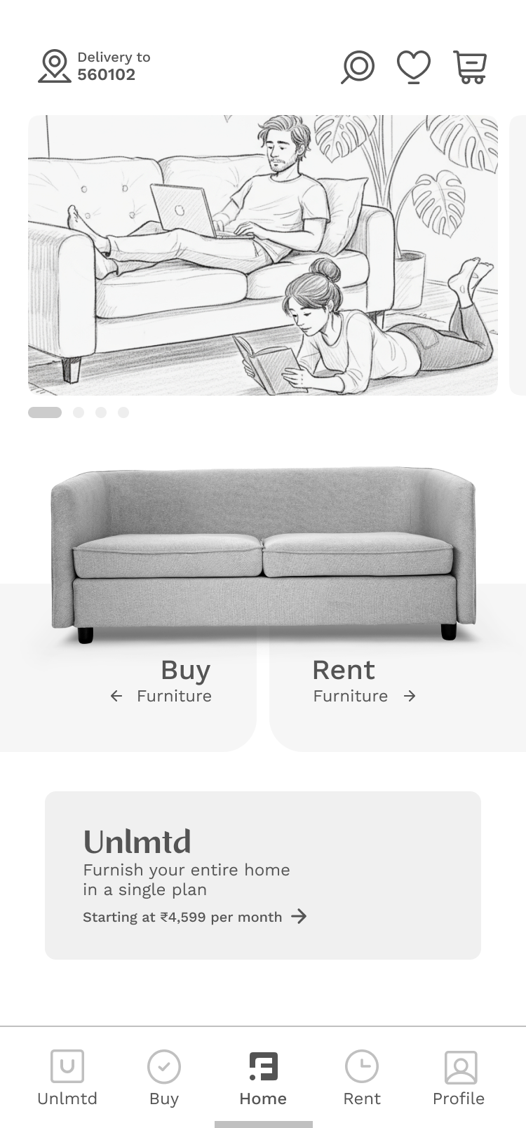
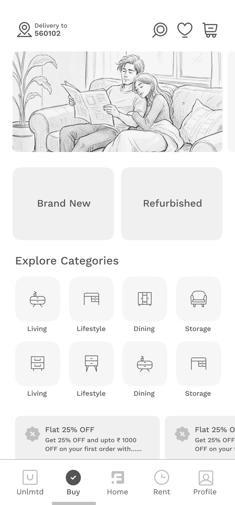
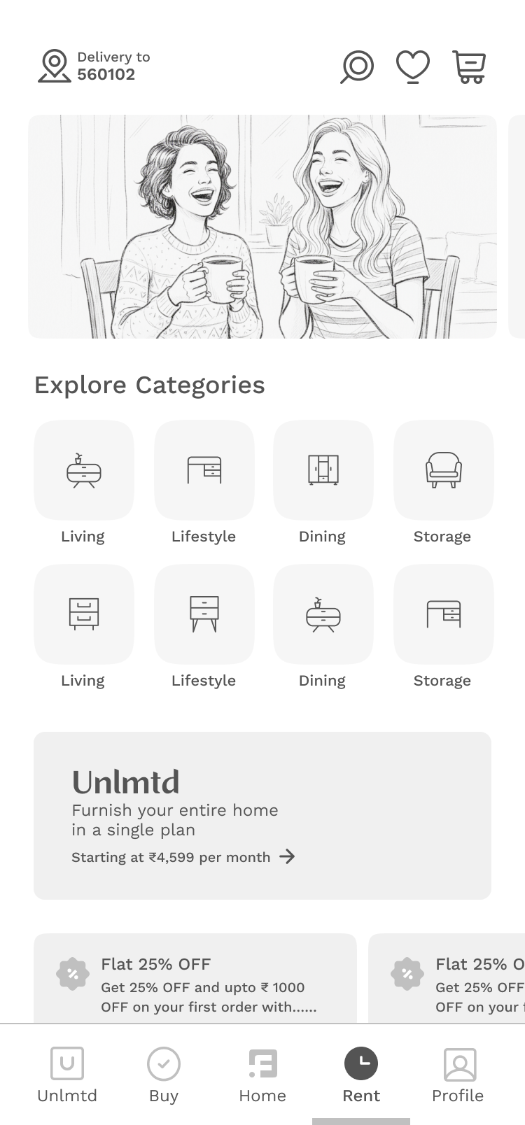
Hi-fidelity Wireframes ready for Fast Prototyping
Evolved beyond structure, and becoming interactive storyboards that map the user's journey
This approach allowed us to visualize the user's journey as a dynamic flow, focusing on the intent behind the design goals. We brought the experience to life by integrating interactive storytelling, ensuring each page and interaction served a purpose in guiding the user toward their desired outcome. The final wireframes don't just show where the user goes, they illustrate why they go there.
Discovery
Clear, Intuitive, Personalised, Smart & Effective
Intent
Transparent, Progressive, Personalised, Live Feedback, Action-oriented CTAs
Transaction
Simplified, Frictionless, Transparent, Progressive, Review-friendly
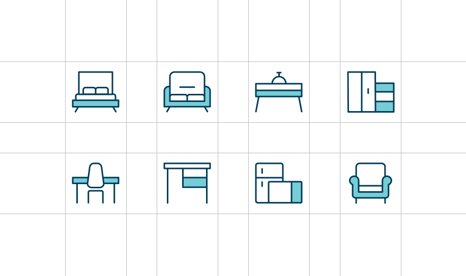
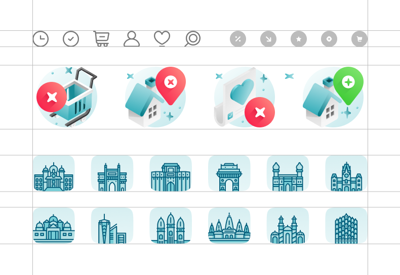
Component Design and Style Guide
Colors & Icons
We designed Furlenco's information architecture to make it easy for users to switch between buying and renting directly from the product pages. By adding a furniture customization feature,

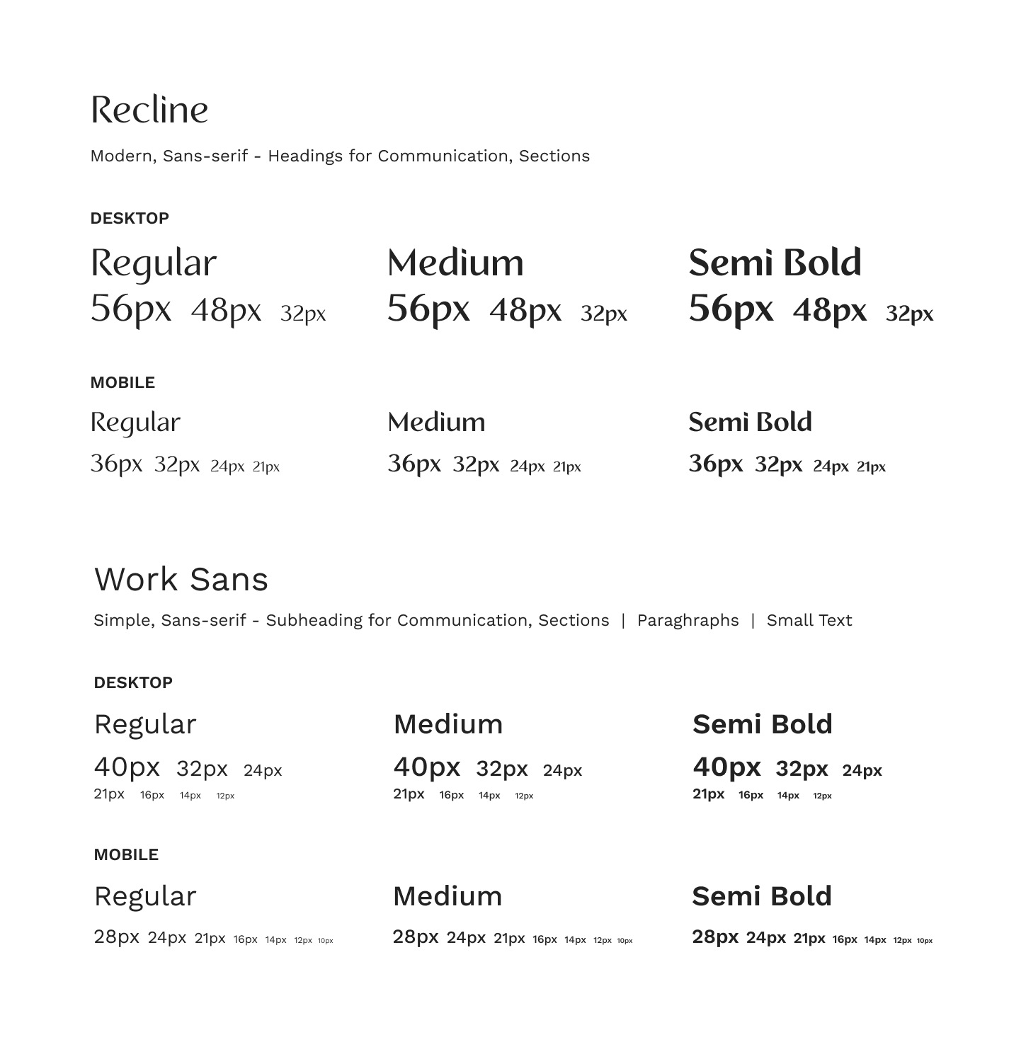
Typography
Strategic Font Pairing
We used two fonts to establish a clear hierarchy: Recline for bold, edgy headings and Work Sans for simple, easy-to-read body text.
Defining Visual Hierarchy
A systematic scale of different sizes and weights was used to guide the user's eye, making content scannable and easy to understand.
Responsive Rules for a "Sane" UI
To ensure a consistent experience, we designed separate rules for desktop and mobile. This optimized for different viewports and user interactions, keeping the interface clean and usable on any device.
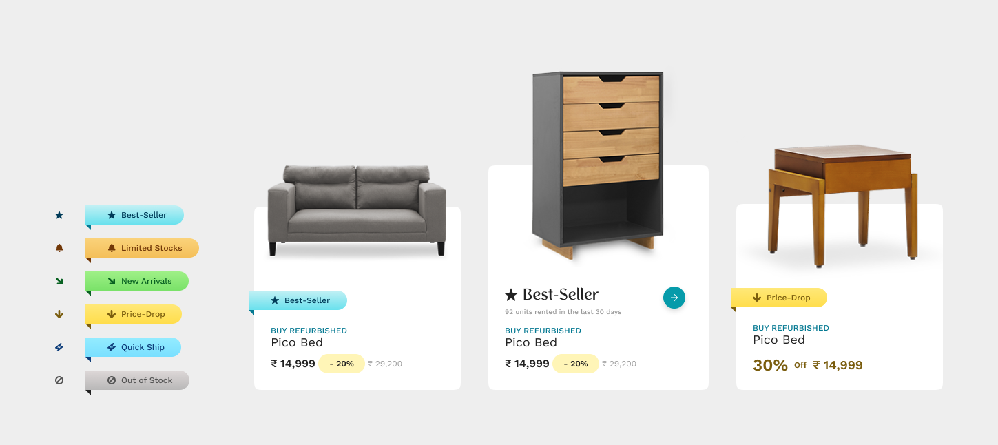
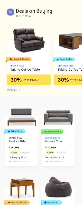
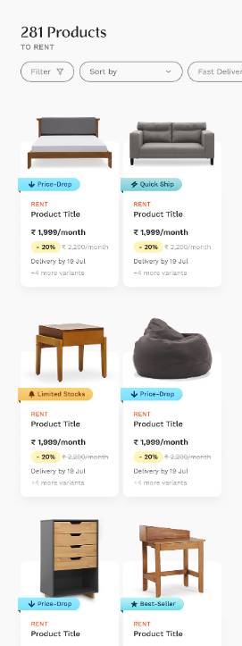
Product Cards
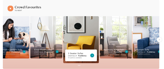
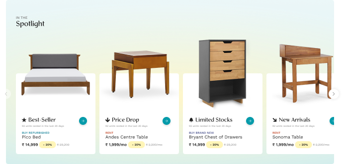
Using an Atomic Design approach, we built modular product cards to be both flexible and emotionally engaging.
Key Design Principles
- Flexible Use Cases: By treating the card as an organism, we can easily add or remove molecules, like badges or buttons, to adapt it for different contexts, from a simple product display to a promotional highlight.
- Product-Focused: The design is clean and minimal, with the product image as the hero. This uncluttered focus aims to trigger a user's "love the product" response.
- Intuitive & Interactive: We integrated subtle interactive elements like hover effects to guide users toward exploring the product more deeply.
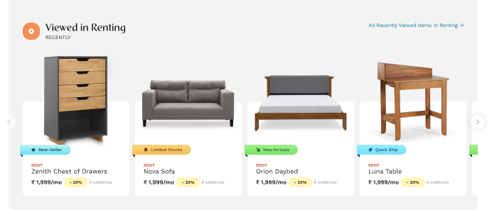
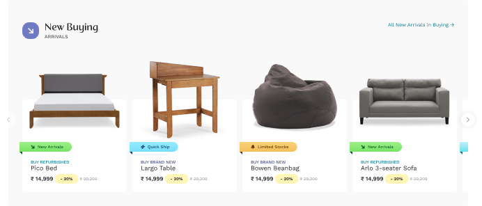
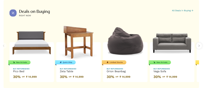
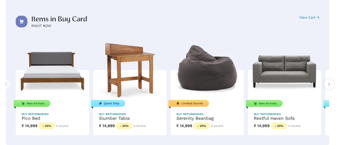
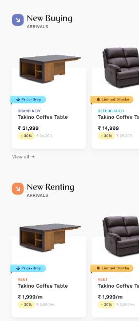
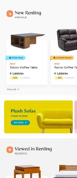
Component Designs for Layouting Service
Our approach used two key design components: foundational layout services and personalized layouts.
First, we structured the UI with layout services to ensure a clean, organized, and intuitive product discovery flow. This allowed users to navigate easily between buying and renting.
Second, we enhanced the experience with a dynamic, personalized feed and features like furniture customization. The UX adapted to user behavior, creating a relevant journey from browsing to final selection.
Final Designs


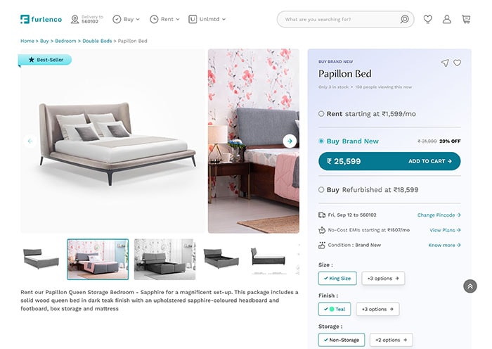
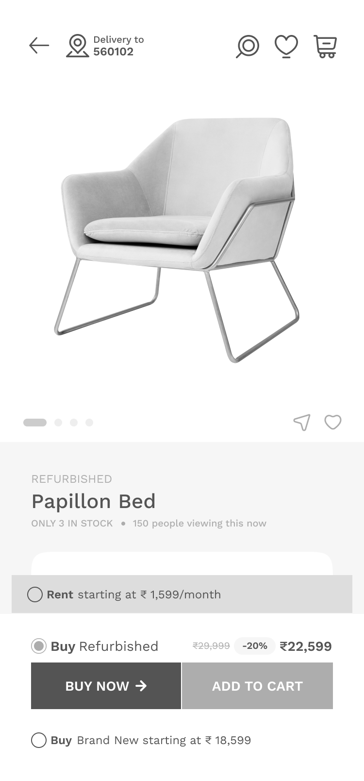
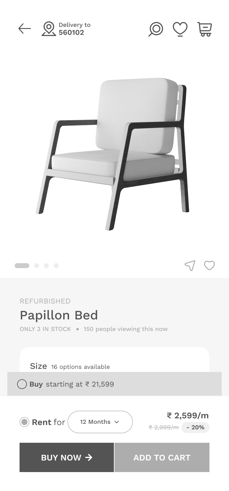
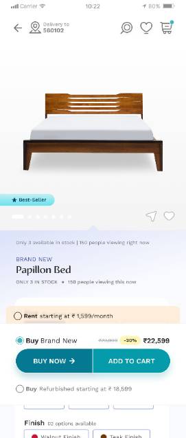
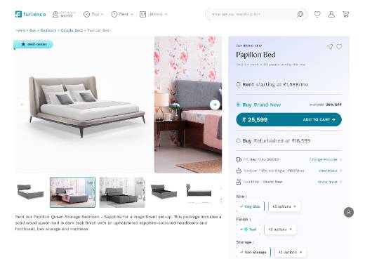
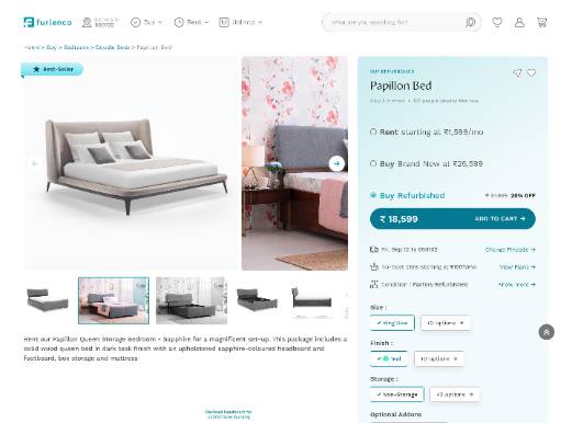
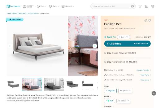
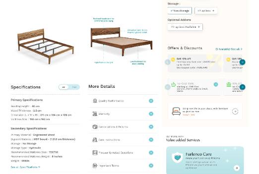
BUSINESS IMPACT: Cross-Vertical Product Detail Page (PDP)
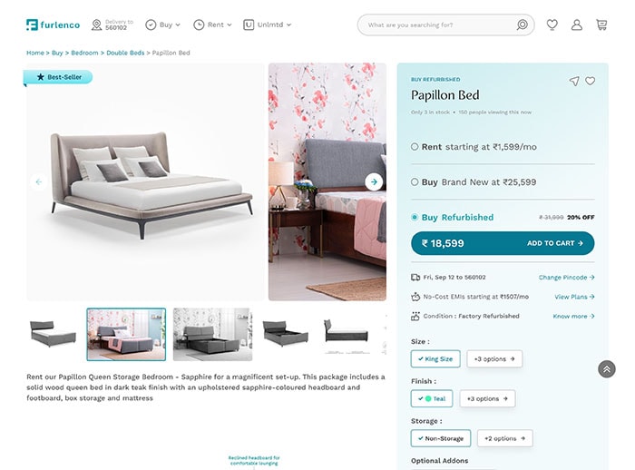
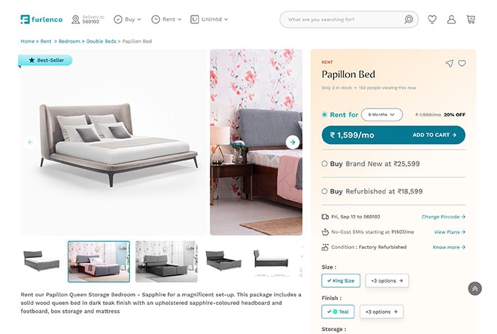
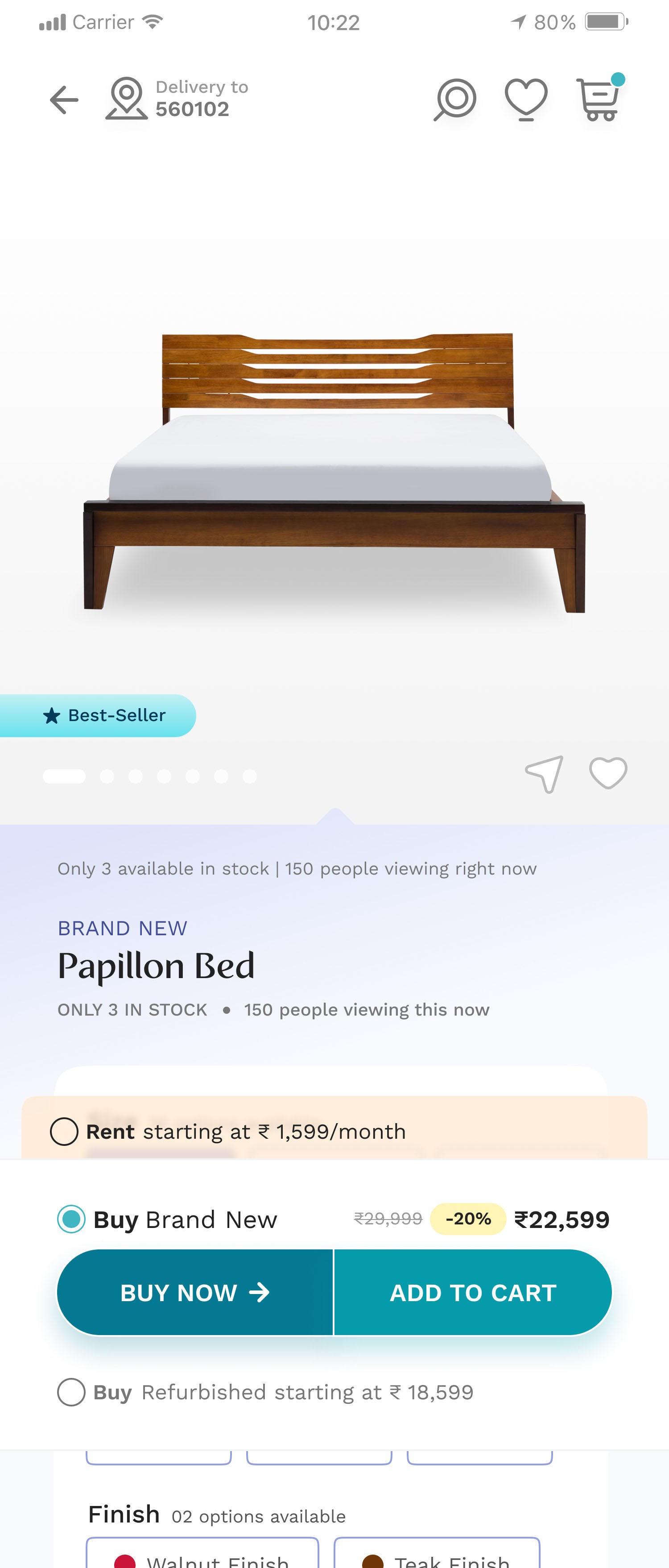
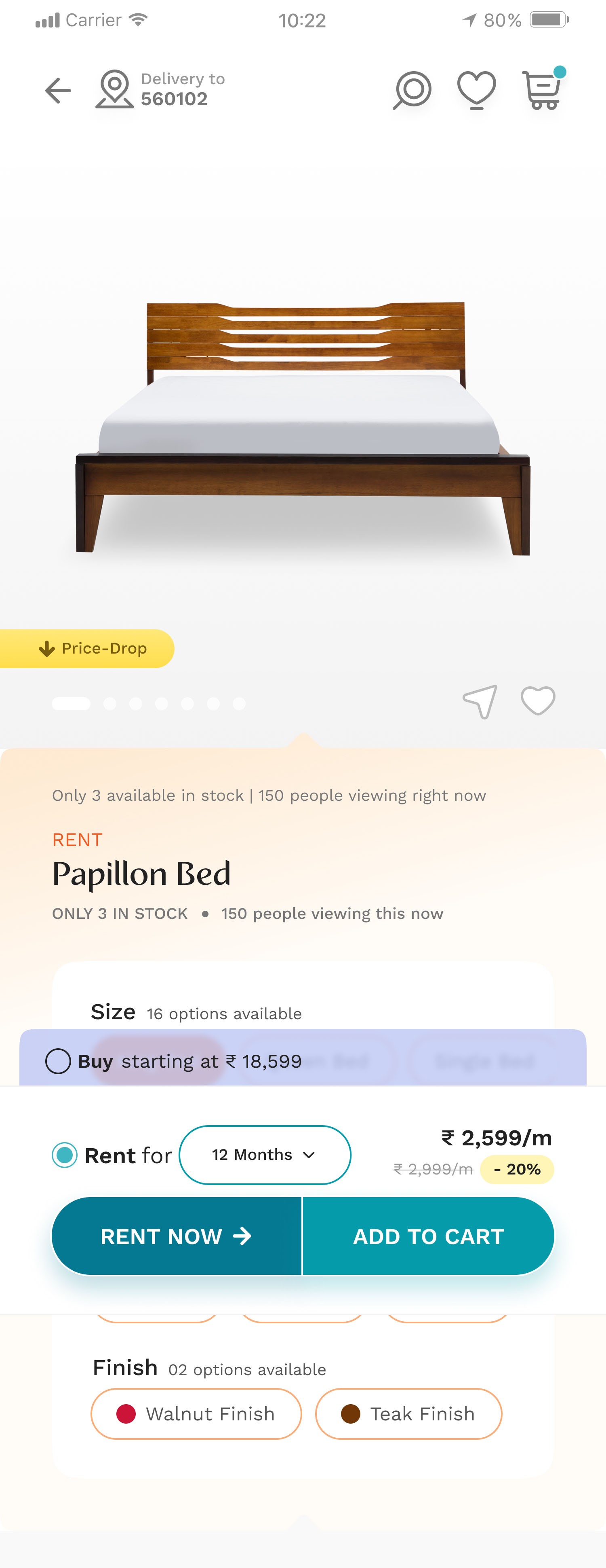
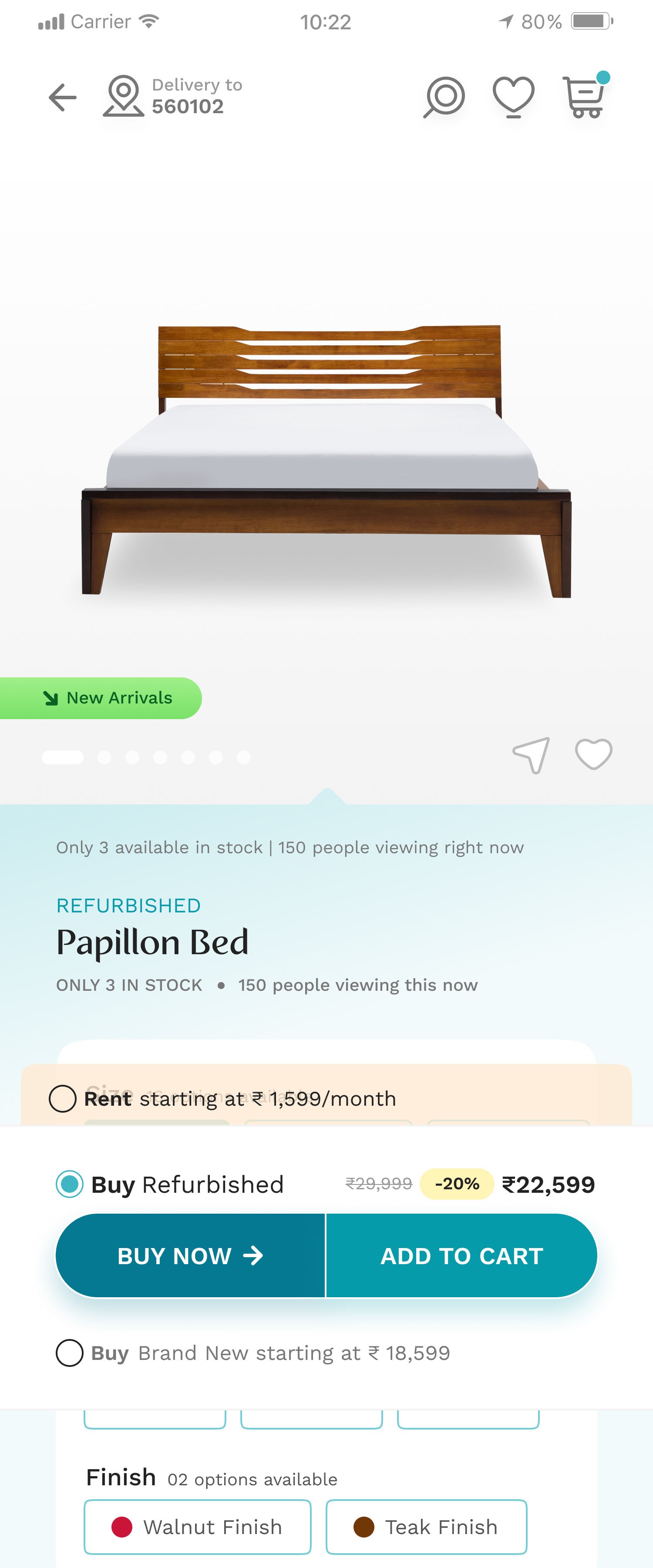
Consolidated Furlenco's distinct Rent and Buy models onto a unified Product Detail Page for the Furlenco 2.0 strategy. This simplified the user experience by showcasing flexible options without decision-making friction.
Challenge & Solution
Challenge
User Confusion: Users will to compare Renting, and Buying across different product pages.
Low Adoption: New "Buy" and "Rent" options had to be immediately discoverable.
Solution
Created a Unified PDP using clear choice architecture for seamless vertical switching. Contextual choices (color-coded variations) were prominently featured near the product visuals, offering instant cost comparison, availability, and delivery timelines.
Key Business Impact
Metric
Uptake of New 'Buy' Vertical
Impact
Validated the market shift and the successful integration of a new core business model.
Result
5% Adoption
of ‘Buy’ vertical from Rent vertical (existing offering)
Out of 100 users exploring the Rental Home page, about 5 navigated to the Buy offerings, resulting in 2 successful orders.
Metric
Overall Conversion Rate
Impact
This notable lift highlights the improved effectiveness and clarity of the new storefront design compared to the older version.
Result
32% increase
in Add to Carts from Product Pages
BUSINESS IMPACT: Cross-Vertical Product Detail Page (PDP)
Automated Furlenco's sales acquisition, moving from offline agents to an automated digital model. Resulted in massive cost savings and improved user experience.
Challenge : Automating Acquisition
Furlenco was heavily dependent on expensive offline sales agents for 50-60% of new sales. The lack of a clear, configurable acquisition funnel hindered self-serve transactions, limiting scalability and driving up operational costs.
Solutions: Acquisition Funnel Journey Enhancements
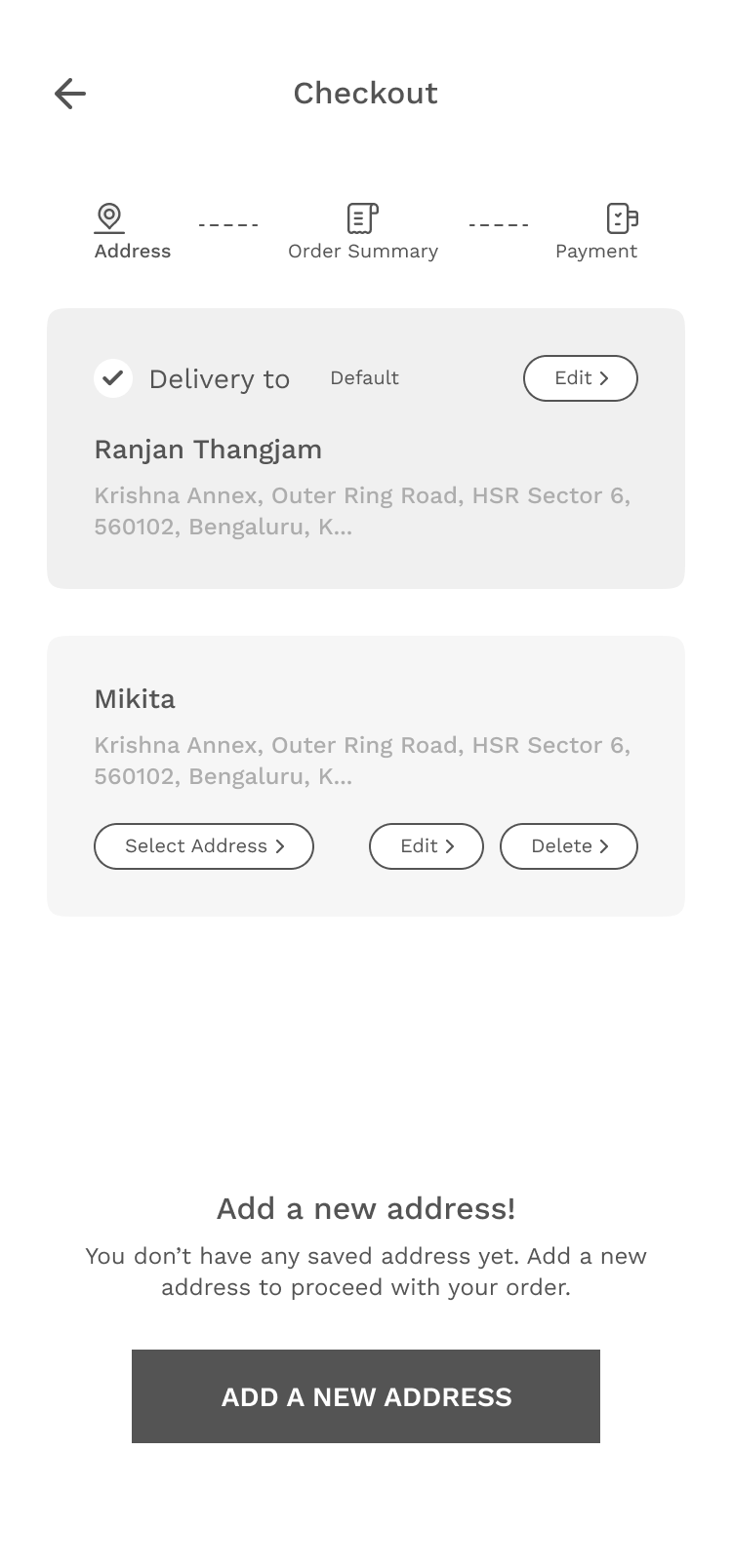
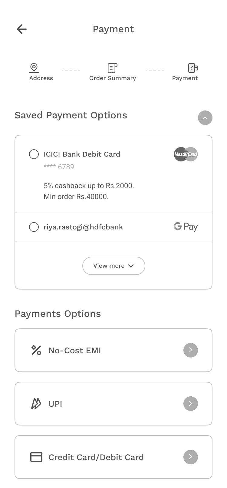
The approach focused on enhancing the five critical touchpoints necessary for a customer to confidently move to a transaction:
Transaction Information
Design Objective
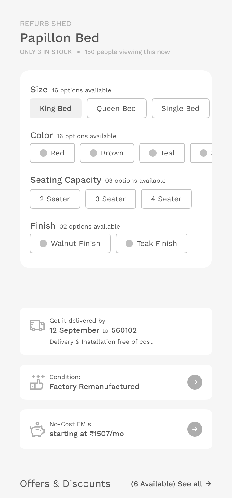
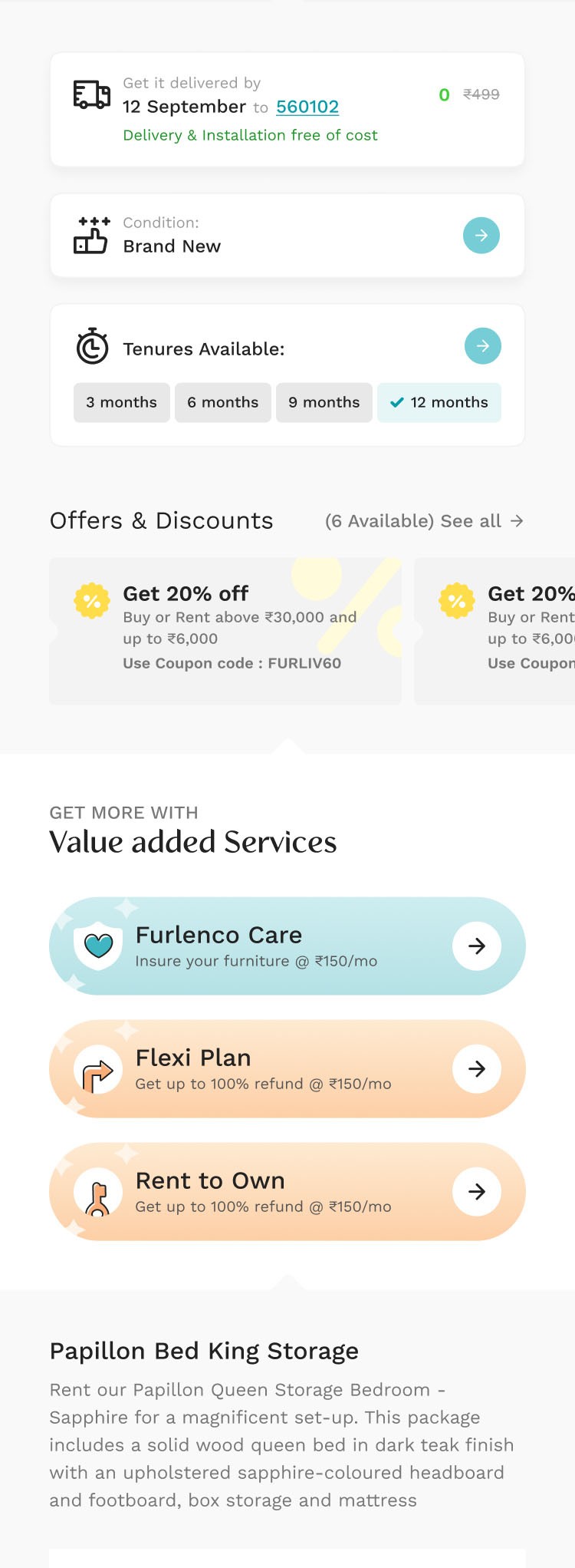
Ensured complete transparency across all verticals (Rental, Buy-New, Refurbished) by clearly setting expectations regarding product condition, included accessories, and remanufacturing definitions.
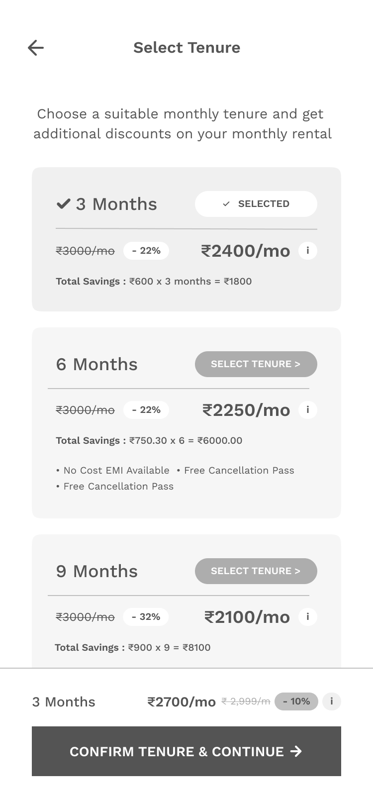
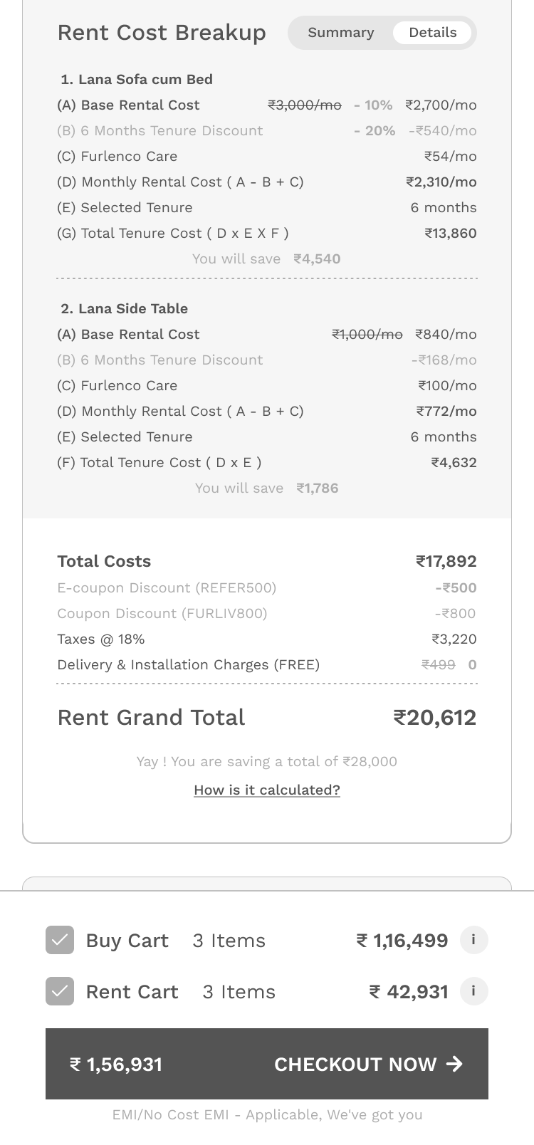
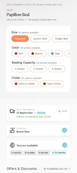
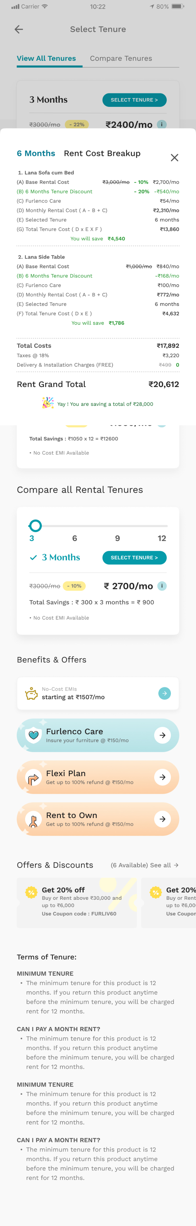
Tenure Selector
Design Objective
Created an intuitive interface for choosing rental durations, supported by detailed pricing breakdowns, value propositions, and emphasis on benefits like No-cost EMI.

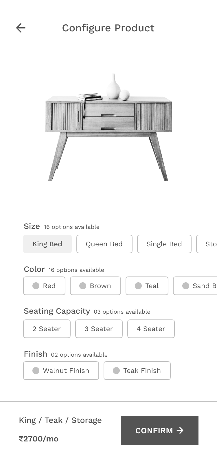
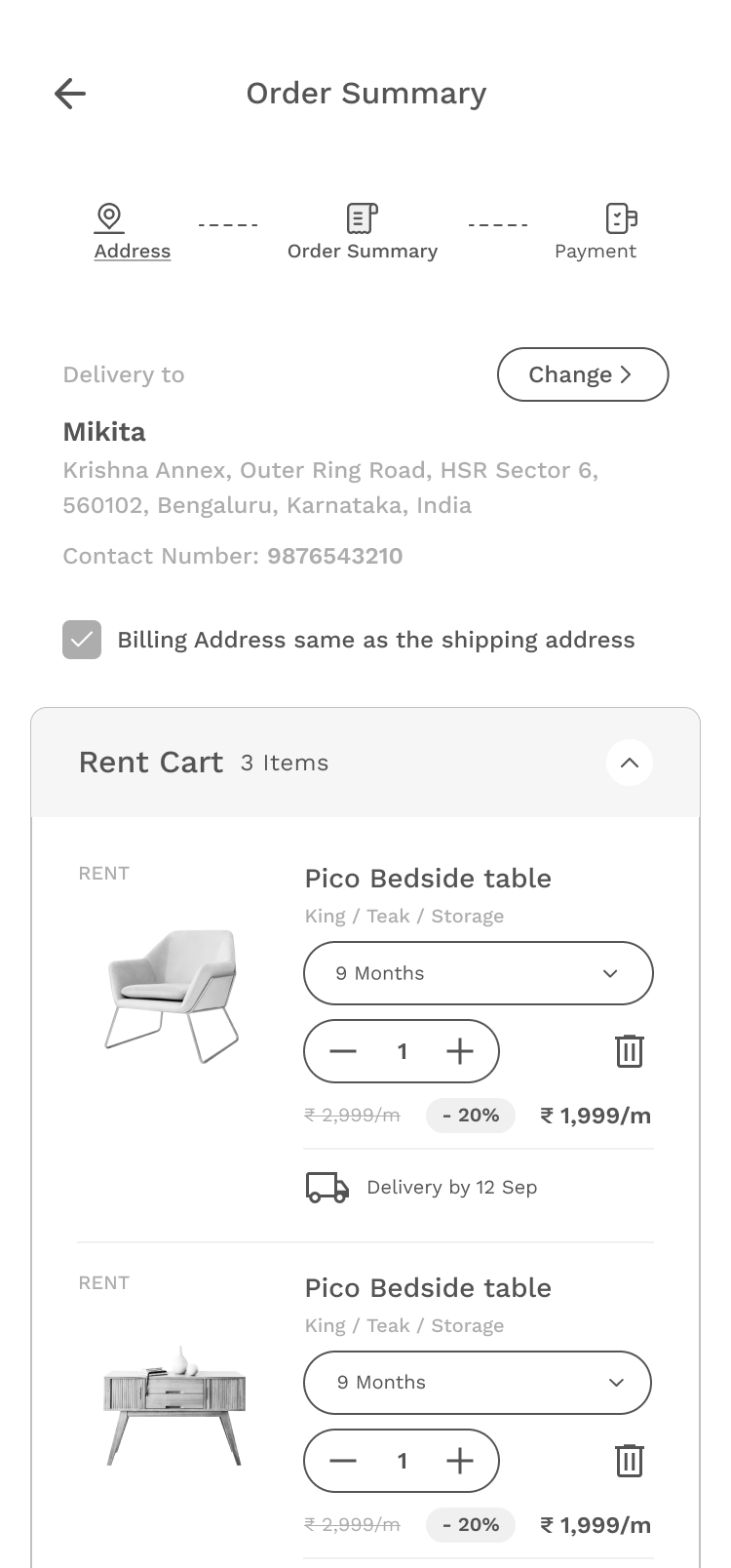
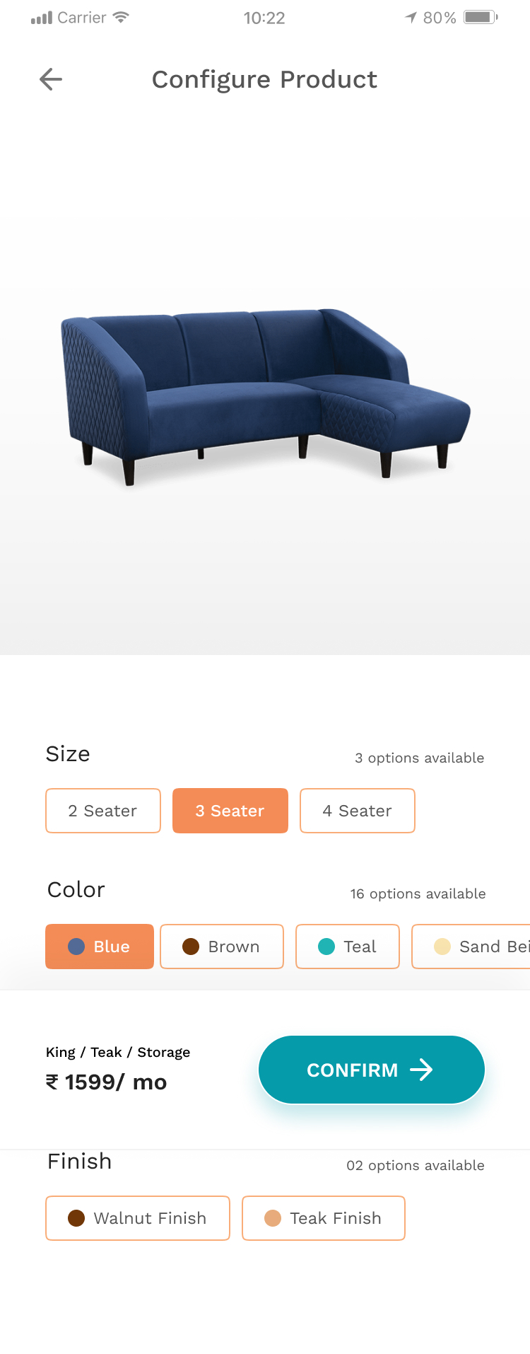
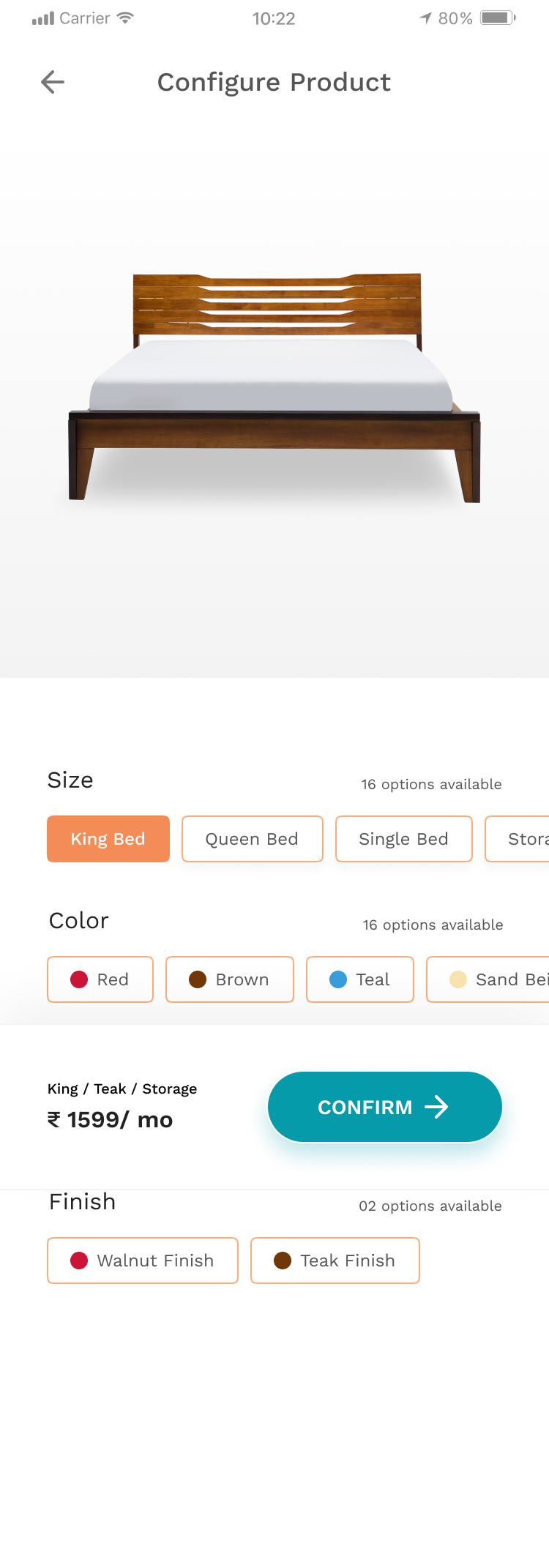
Product Options Configurator
Design Objective
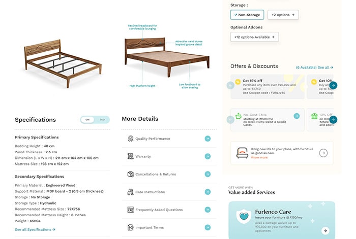
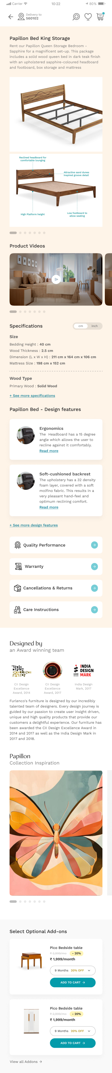
Empowered users by offering rich configuration tools for various sizes, features, finishes, and add-ons, maximizing product discovery and purchase flexibility.
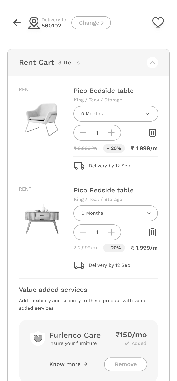
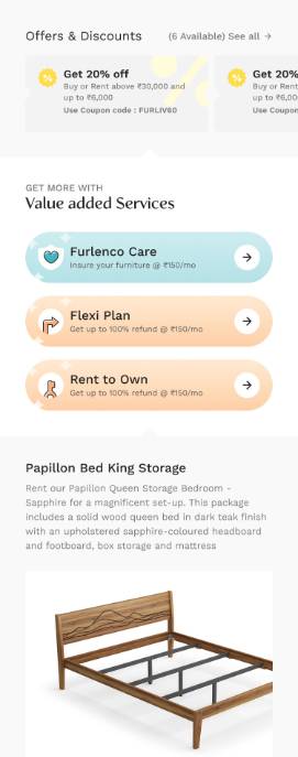
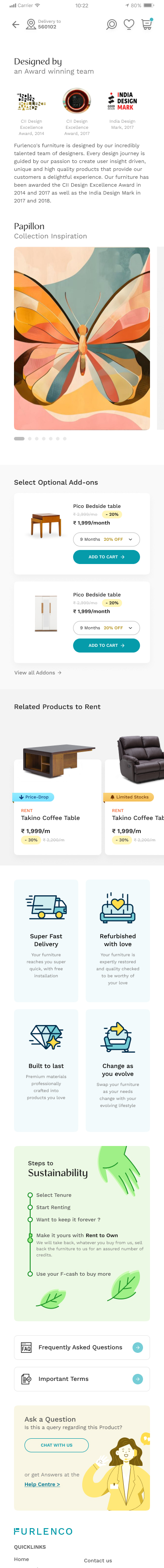
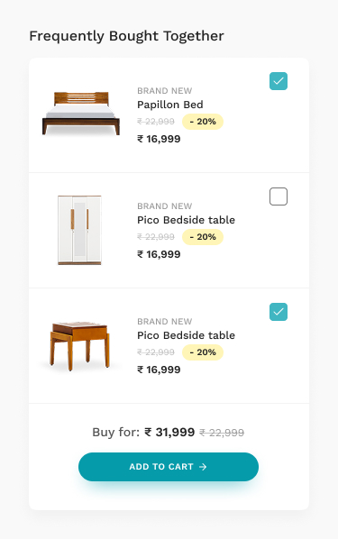
Recommendations & Related Products
Design Objective
Integrated relevant products and accessories to create a comprehensive and seamless single-session shopping experience.
Key Business Impact
Metric
Cost Reduction
Impact
Achieved by successfully transitioning from sales-agent dependency to a low-touch automated funnel.
Result
70%
Reduction in acquisition costs.
Metric
Engagement Lift (PDP to ATC)
Impact
Highlights the success of the enhanced PDP in driving user engagement and intent.
Result
32% increase
in Product Detail Page (PDP) to Add to Cart (ATC) conversions.
Prev Project
Next Project
CONTACT
Currently looking out for new opportunities
Last updated September 2025
Head/Lead Product or UX Design Roles
Bengaluru, NCR, Mumbai, Pune
Lead / Staff / Principal / Senior Product or UX Design Roles
Remote
Product / UX / Branding / Packaging / Communication Design Projects
Contract / Freelance

Behance Portfolio


Ranjan.thangjam@gmail.com

+91 - 9916 744 Six Eight Zero

Built entirely on Figma Sites from scratch. Case Study on Exploration of Figma Sites + it’s current limitations and work-arounds > COMING SOON
Intro
Work
References
Contact
Furlenco 2.0
Mobile App & UX UI Design
UX Leadership, Research, Strategy, Hands-on Design, Prototyping and Testing
Prev Project
Next Project
ABOUT THE PROJECT
Furlenco was looking for an evolution to broaden its userbase and offerings to now give customers the power of choice between renting, subscribing, & “buying” furniture as a new feature.
Implement a Flexibility of Choice to switch between Buying/Renting/Subscribing during the discovery funnel.
Build and apply a new UX/UI Design System to align to the new brand look and positioning
Enhance the existing Self-serve Subscription Management UX with a faster automated flow
Leverage a better UX with Layouting service, that can generate Customized user-views and target better.
Design Framework

Empathize
The Foundation of Understanding the User
Action
Moved beyond surface data by analyzing customer complaints, click-through data, and churn rates to pinpoint true user pain points.
Outcome
This deep user insight allowed us to define problems from the user's perspective, ensuring every solution we designed was solving a real, rather than assumed, issue.

Define
Identifying Requirements and Opportunities
Action
Translated user insights into product requirements for cross-service discovery, streamlined checkout, and self-managed subscriptions.
Outcome
This strategic definition phase created a roadmap for targeted solutions that directly addressed user friction points and unlocked new business opportunities.

Ideate
Building a Scalable Blueprint and Experience
Action
We re-architected the user experience with new user flows, creating a foundation for cross-selling and up-selling products and services.
Outcome
This strategic foresight ensured a scalable platform that not only optimized the current user journey but also positioned the business for future growth.

Prototype & Test
Validating with Users and Stakeholders
Action
Built and tested high-fidelity prototypes and a robust design system to validate solutions and ensure usability prior to development.
Outcome
This iterative approach helped us fix usability hurdles early, saving significant development resources while ensuring a high-quality experience.
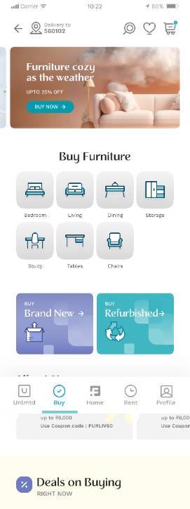
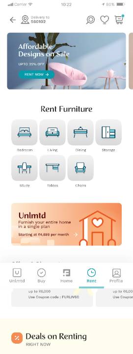
Information Architecture with Enhanced Product Discovery & Customization
We designed Furlenco's information architecture to make it easy for users to switch between buying and renting directly from the product pages. By adding a furniture customization feature, we created a more personalized experience that guides users smoothly from browsing to selecting their final choice.
Buying / Renting Information Architecture

Unlmtd Information Architecture
Hi-fidelity Wireframes ready for Fast Prototyping
Evolved beyond structure, and becoming interactive storyboards that map the user's journey
This approach allowed us to visualize the user's journey as a dynamic flow, focusing on the intent behind the design goals. We brought the experience to life by integrating interactive storytelling, ensuring each page and interaction served a purpose in guiding the user toward their desired outcome. The final wireframes don't just show where the user goes, they illustrate why they go there.
Discovery
Clear, Intuitive, Personalised, Smart & Effective
Intent
Transparent, Progressive, Personalised, Live Feedback, Action-oriented CTAs
Transaction
Simplified, Frictionless, Transparent, Progressive, Review-friendly
Component Design and Style Guide
Colors & Icons
We designed Furlenco's information architecture to make it easy for users to switch between buying and renting directly from the product pages. By adding a furniture customization feature,
Typography
Strategic Font Pairing
We used two fonts to establish a clear hierarchy: Recline for bold, edgy headings and Work Sans for simple, easy-to-read body text.
Defining Visual Hierarchy
A systematic scale of different sizes and weights was used to guide the user's eye, making content scannable and easy to understand.
Responsive Rules for a "Sane" UI
To ensure a consistent experience, we designed separate rules for desktop and mobile. This optimized for different viewports and user interactions, keeping the interface clean and usable on any device.
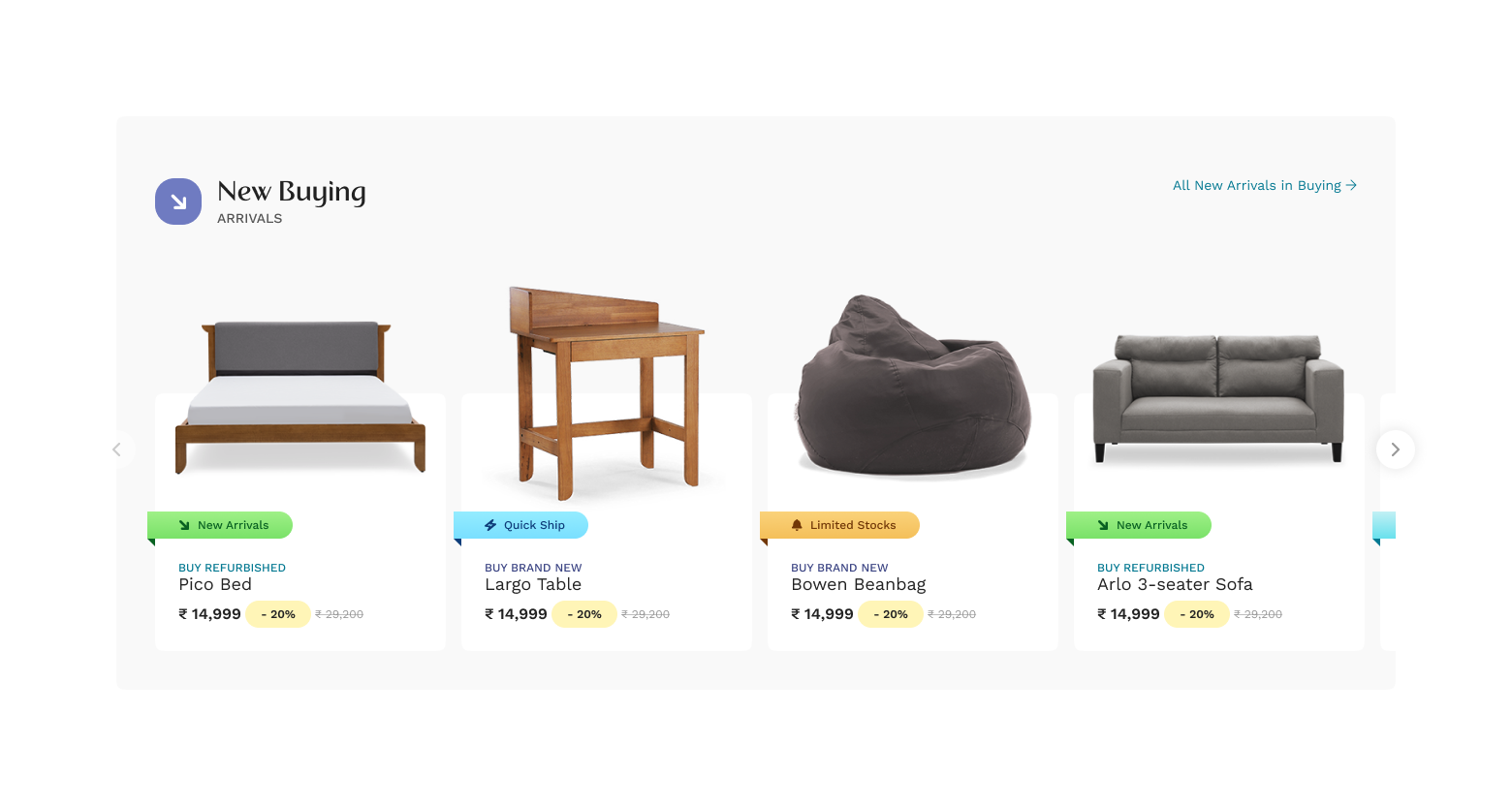
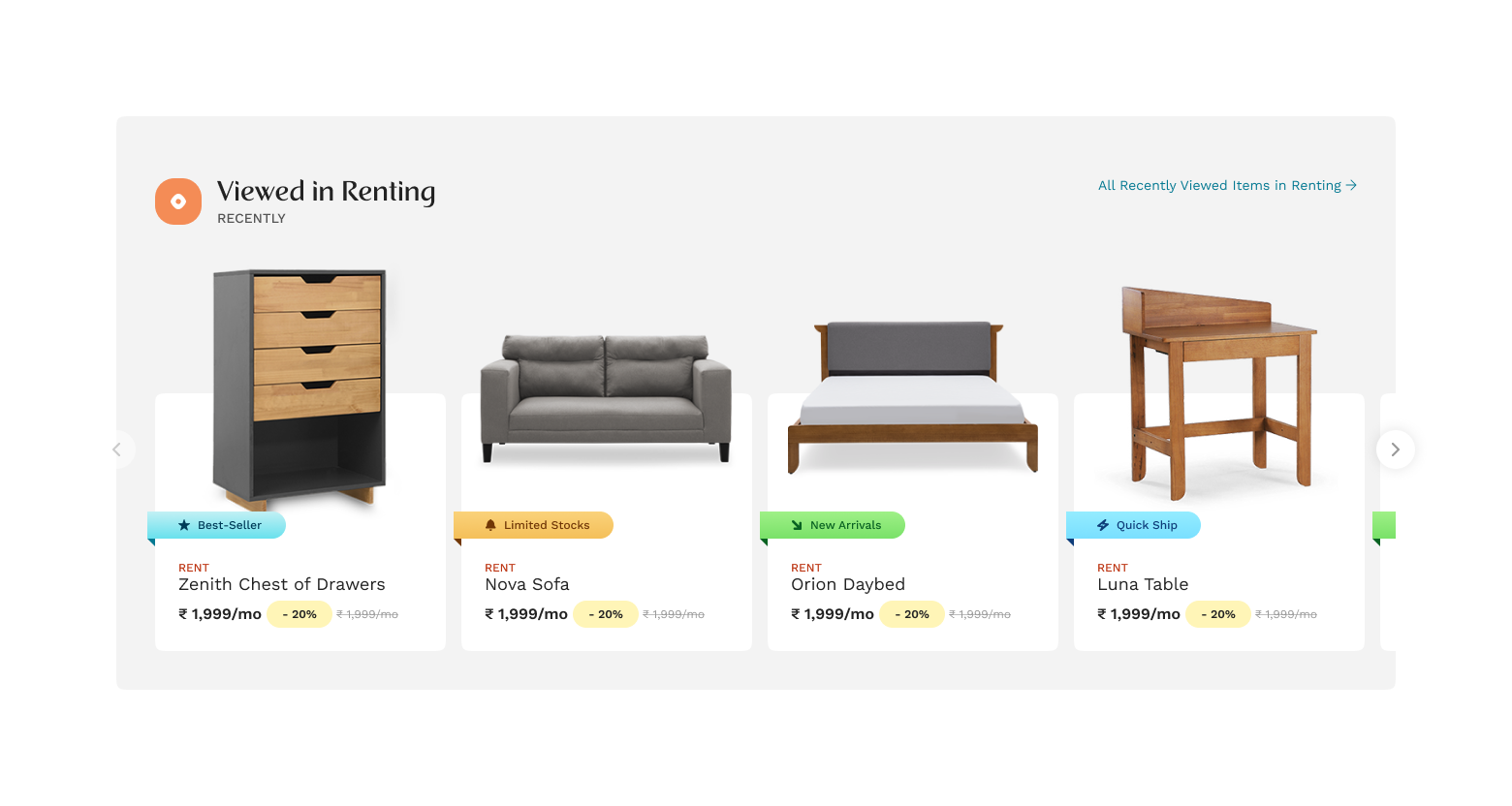
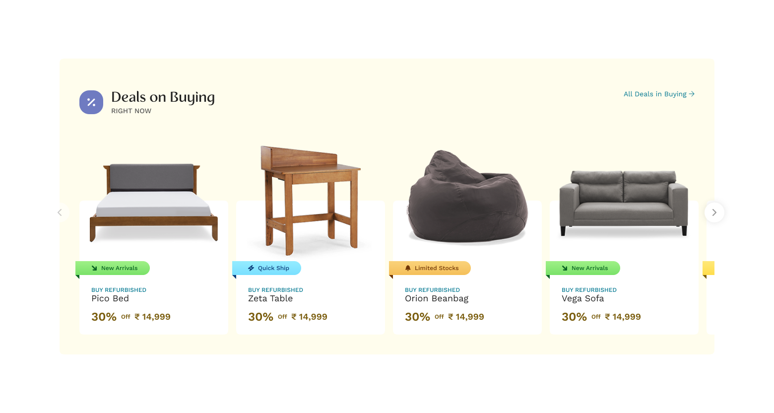
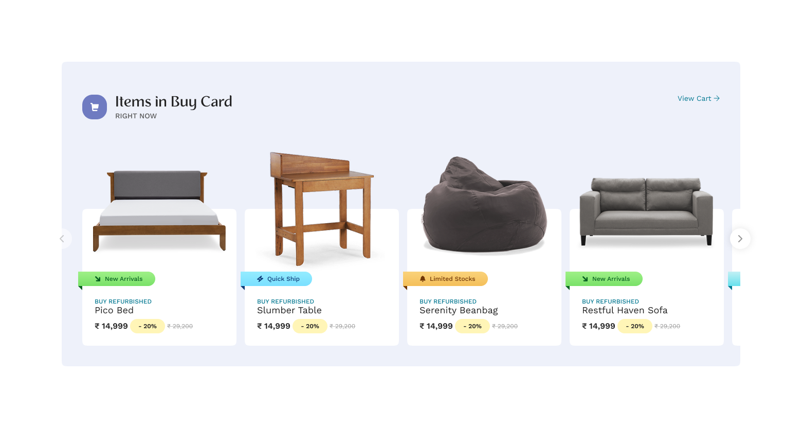
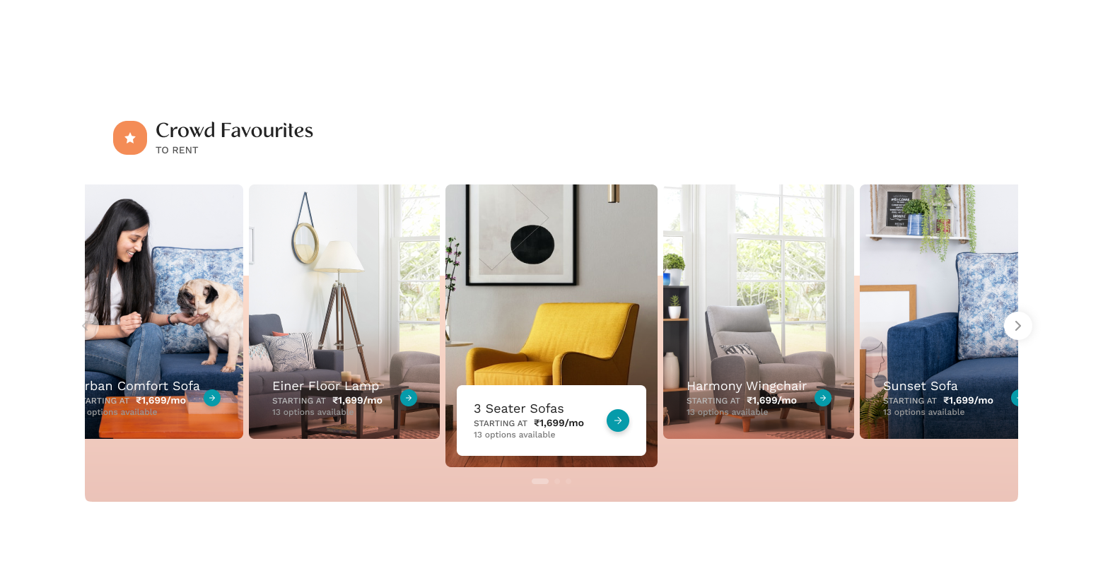
Product Cards
Using an Atomic Design approach, we built modular product cards to be both flexible and emotionally engaging.
Key Design Principles
- Flexible Use Cases: By treating the card as an organism, we can easily add or remove molecules, like badges or buttons, to adapt it for different contexts, from a simple product display to a promotional highlight.
- Product-Focused: The design is clean and minimal, with the product image as the hero. This uncluttered focus aims to trigger a user's "love the product" response.
- Intuitive & Interactive: We integrated subtle interactive elements like hover effects to guide users toward exploring the product more deeply.
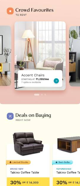
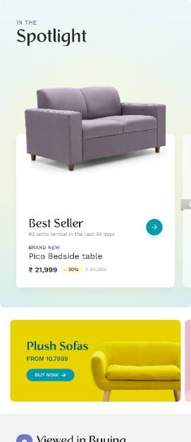
Component Designs for Layouting Service
Our approach used two key design components: foundational layout services and personalized layouts.
First, we structured the UI with layout services to ensure a clean, organized, and intuitive product discovery flow. This allowed users to navigate easily between buying and renting.
Second, we enhanced the experience with a dynamic, personalized feed and features like furniture customization. The UX adapted to user behavior, creating a relevant journey from browsing to final selection.
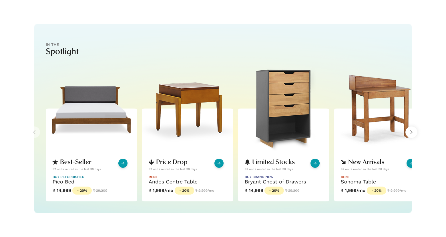
Finals Designs for
Layouting Service
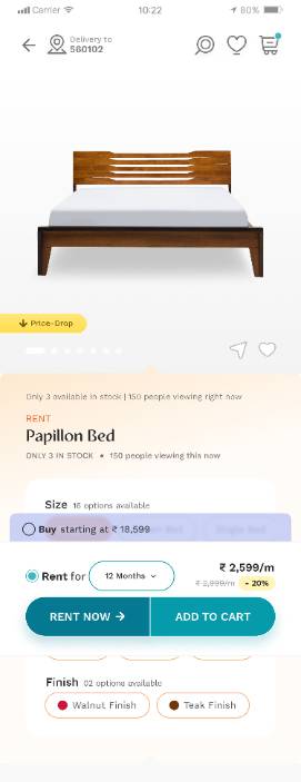


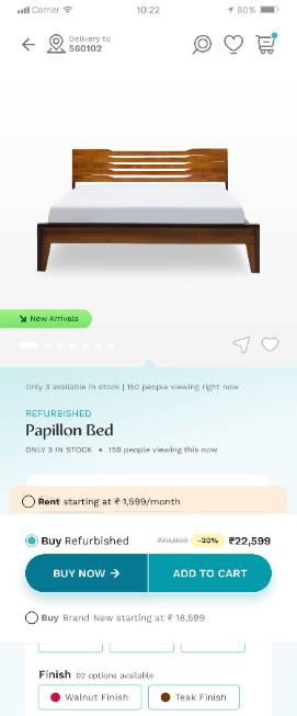
BUSINESS IMPACT: Cross-Vertical Product Detail Page (PDP)
Consolidated Furlenco's distinct Rent and Buy models onto a unified Product Detail Page for the Furlenco 2.0 strategy. This simplified the user experience by showcasing flexible options without decision-making friction.
Challenge & Solution
Challenge
User Confusion: Users will to compare Renting, and Buying across different product pages.
Low Adoption: New "Buy" and "Rent" options had to be immediately discoverable.
Solution
Created a Unified PDP using clear choice architecture for seamless vertical switching. Contextual choices (color-coded variations) were prominently featured near the product visuals, offering instant cost comparison, availability, and delivery timelines.
Key Business Impact
Metric
Uptake of New 'Buy' Vertical
Impact
Validated the market shift and the successful integration of a new core business model.
Result
5% Adoption
of ‘Buy’ vertical from Rent vertical (existing offering)
Out of 100 users exploring the Rental Home page, about 5 navigated to the Buy offerings, resulting in 2 successful orders.
Metric
Overall Conversion Rate
Impact
This notable lift highlights the improved effectiveness and clarity of the new storefront design compared to the older version.
Result
32% increase
in Add to Carts from Product Pages
BUSINESS IMPACT: Cross-Vertical Product Detail Page (PDP)
Automated Furlenco's sales acquisition, moving from offline agents to an automated digital model. Resulted in massive cost savings and improved user experience.
Challenge : Automating Acquisition
Furlenco was heavily dependent on expensive offline sales agents for 50-60% of new sales. The lack of a clear, configurable acquisition funnel hindered self-serve transactions, limiting scalability and driving up operational costs.
Solutions: Acquisition Funnel Journey Enhancements
The approach focused on enhancing the five critical touchpoints necessary for a customer to confidently move to a transaction:
Transaction Information
Design Objective
Ensured complete transparency across all verticals (Rental, Buy-New, Refurbished) by clearly setting expectations regarding product condition, included accessories, and remanufacturing definitions.
Tenure Selector
Design Objective
Created an intuitive interface for choosing rental durations, supported by detailed pricing breakdowns, value propositions, and emphasis on benefits like No-cost EMI.
Product Options Configurator
Design Objective
Empowered users by offering rich configuration tools for various sizes, features, finishes, and add-ons, maximizing product discovery and purchase flexibility.
Recommendations & Related Products
Design Objective
Integrated relevant products and accessories to create a comprehensive and seamless single-session shopping experience.
Key Business Impact
Metric
Cost Reduction
Impact
Achieved by successfully transitioning from sales-agent dependency to a low-touch automated funnel.
Result
70%
Reduction in acquisition costs.
Metric
Engagement Lift (PDP to ATC)
Impact
Highlights the success of the enhanced PDP in driving user engagement and intent.
Result
32% increase
in Product Detail Page (PDP) to Add to Cart (ATC) conversions.
Prev Project
Next Project
CONTACT
Currently looking out for new opportunities
Last updated September 2025
Head/Lead Product or UX Design Roles
Bengaluru, NCR, Mumbai, Pune
Lead / Staff / Principal / Senior Product or UX Design Roles
Remote
Product / UX / Branding / Packaging / Communication Design Projects
Contract / Freelance
Behance Portfolio
Ranjan.thangjam@gmail.com
+91 - 9916 744 Six Eight Zero
Built entirely on Figma Sites from scratch. Case Study on Exploration of Figma Sites + it’s current limitations and work-arounds > COMING SOON

Intro
Work
Resources
Contact
Furlenco 2.0
Mobile App & UX UI Design
UX Leadership, Research, Strategy, Hands-on Design, Prototyping and Testing
Prev Project
Next Project
ABOUT THE PROJECT
Furlenco was looking for an evolution to broaden its userbase and offerings to now give customers the power of choice between renting, subscribing, & “buying” furniture as a new feature.
Implement a Flexibility of Choice to switch between Buying/Renting/Subscribing during the discovery funnel.
Build and apply a new UX/UI Design System to align to the new brand look and positioning
Enhance the existing Self-serve Subscription Management UX with a faster automated flow
Leverage a better UX with Layouting service, that can generate Customized user-views and target better.
Design Framework
Empathize
The Foundation of Understanding the User
Action
Moved beyond surface data by analyzing customer complaints, click-through data, and churn rates to pinpoint true user pain points.
Outcome
This deep user insight allowed us to define problems from the user's perspective, ensuring every solution we designed was solving a real, rather than assumed, issue.
Define
Identifying Requirements and Opportunities
Action
Translated user insights into product requirements for cross-service discovery, streamlined checkout, and self-managed subscriptions.
Outcome
This strategic definition phase created a roadmap for targeted solutions that directly addressed user friction points and unlocked new business opportunities.
Ideate
Building a Scalable Blueprint and Experience
Action
We re-architected the user experience with new user flows, creating a foundation for cross-selling and up-selling products and services.
Outcome
This strategic foresight ensured a scalable platform that not only optimized the current user journey but also positioned the business for future growth.
Prototype & Test
Validating with Users and Stakeholders
Action
Built and tested high-fidelity prototypes and a robust design system to validate solutions and ensure usability prior to development.
Outcome
This iterative approach helped us fix usability hurdles early, saving significant development resources while ensuring a high-quality experience.
Information Architecture with Enhanced Product Discovery & Customization
We designed Furlenco's information architecture to make it easy for users to switch between buying and renting directly from the product pages. By adding a furniture customization feature, we created a more personalized experience that guides users smoothly from browsing to selecting their final choice.
Hi-fidelity Wireframes ready for Fast Prototyping
Evolved beyond structure, and becoming interactive storyboards that map the user's journey
Instead of simply translating the information This approach allowed us to visualize the user's journey as a dynamic flow, focusing on the intent behind the design goals. We brought the experience to life by integrating interactive storytelling, ensuring each page and interaction served a purpose in guiding the user toward their desired outcome. The final wireframes don't just show where the user goes, they illustrate why they go there.
Discovery
Clear, Intuitive, Personalised, Smart & Effective
Intent
Transparent, Progressive, Personalised, Live Feedback, Action-oriented CTAs
Transaction
Simplified, Frictionless, Transparent, Progressive, Review-friendly
Component Design and Style Guide
Colors & Icons
We designed Furlenco's information architecture to make it easy for users to switch between buying and renting directly from the product pages. By adding a furniture customization feature,

Typography
Strategic Font Pairing
We used two fonts to establish a clear hierarchy: Recline for bold, edgy headings and Work Sans for simple, easy-to-read body text.
Defining Visual Hierarchy
A systematic scale of different sizes and weights was used to guide the user's eye, making content scannable and easy to understand.
Responsive Rules for a "Sane" UI
To ensure a consistent experience, we designed separate rules for desktop and mobile. This optimized for different viewports and user interactions, keeping the interface clean and usable on any device.
Product Cards
Using an Atomic Design approach, we built modular product cards to be both flexible and emotionally engaging.
Key Design Principles
- Flexible Use Cases: By treating the card as an organism, we can easily add or remove molecules, like badges or buttons, to adapt it for different contexts, from a simple product display to a promotional highlight.
- Product-Focused: The design is clean and minimal, with the product image as the hero. This uncluttered focus aims to trigger a user's "love the product" response.
- Intuitive & Interactive: We integrated subtle interactive elements like hover effects to guide users toward exploring the product more deeply.
Component Designs for
Layouting Service
Our approach used two key design components: foundational layout services and personalized layouts.
First, we structured the UI with layout services to ensure a clean, organized, and intuitive product discovery flow. This allowed users to navigate easily between buying and renting.
Second, we enhanced the experience with a dynamic, personalized feed and features like furniture customization. The UX adapted to user behavior, creating a relevant journey from browsing to final selection.
Final Designs
BUSINESS IMPACT: Cross-Vertical Product Detail Page (PDP)
Consolidated Furlenco's distinct Rent and Buy models onto a unified Product Detail Page for the Furlenco 2.0 strategy. This simplified the user experience by showcasing flexible options without decision-making friction.
Challenge & Solution
Challenge
User Confusion: Users will to compare Renting, and Buying across different product pages.
Low Adoption: New "Buy" and "Rent" options had to be immediately discoverable.
Solution
Created a Unified PDP using clear choice architecture for seamless vertical switching. Contextual choices (color-coded variations) were prominently featured near the product visuals, offering instant cost comparison, availability, and delivery timelines.
Key Business Impact
Metric
Uptake of New 'Buy' Vertical
Impact
Validated the market shift and the successful integration of a new core business model.
Result
5% Adoption
of ‘Buy’ vertical from Rent vertical (existing offering)
Out of 100 users exploring the Rental Home page, about 5 navigated to the Buy offerings, resulting in 2 successful orders.
Metric
Overall Conversion Rate
Impact
This notable lift highlights the improved effectiveness and clarity of the new storefront design compared to the older version.
Result
32% increase
in Add to Carts from Product Pages
BUSINESS IMPACT: Revamped Acquisition Journey UX
Automated Furlenco's sales acquisition, moving from offline agents to an automated digital model. Resulted in massive cost savings and improved user experience.
Challenge : Automating Acquisition
Furlenco was heavily dependent on expensive offline sales agents for 50-60% of new sales. The lack of a clear, configurable acquisition funnel hindered self-serve transactions, limiting scalability and driving up operational costs.
Solutions: Acquisition Funnel Journey Enhancements
The approach focused on enhancing the five critical touchpoints necessary for a customer to confidently move to a transaction:
Transaction Information
Design Objective
Established complete transparency across all verticals (Rental, Buy-New, Refurbished) by clarifying product condition, accessories, and remanufacturing definitions.
Tenure Selector
Design Objective
Created an intuitive interface for choosing rental durations, supported by detailed pricing breakdowns, value propositions, and emphasis on benefits like No-cost EMI.
Product Options Configurator
Design Objective
Empowered users by offering rich configuration tools for various sizes, features, finishes, and add-ons, maximizing product discovery and purchase flexibility.
Recommendations & Related Products
Design Objective
Integrated relevant products and accessories to create a comprehensive and seamless single-session shopping experience.
Key Business Impact
Metric
Cost Reduction
Impact
Achieved by successfully transitioning from sales-agent dependency to a low-touch automated funnel.
Result
70%
Reduction in acquisition costs.
Metric
Engagement Lift (PDP to ATC)
Impact
Highlights the success of the enhanced PDP in driving user engagement and intent.
Result
32% increase
in Product Detail Page (PDP) to Add to Cart (ATC) conversions.
Prev Project
Next Project
CONTACT
Currently looking out for new opportunities
Last updated September 2025
Head/Lead Product or UX Design Roles
Bengaluru, NCR, Mumbai, Pune
Lead / Staff / Principal / Senior Product or UX Design Roles
Remote
Product / UX / Branding / Packaging / Communication Design Projects
Contract / Freelance
Behance Portfolio
+91 - 9916 744 Six Eight Zero
Ranjan.thangjam@gmail.com
Built entirely on Figma Sites from scratch. Case Study on Exploration of Figma Sites + it’s current limitations and work-arounds > COMING SOON